Web3 Gaming · NFT Platform · Web-first Product Design
Designing a Web3 gaming platform from the ground up
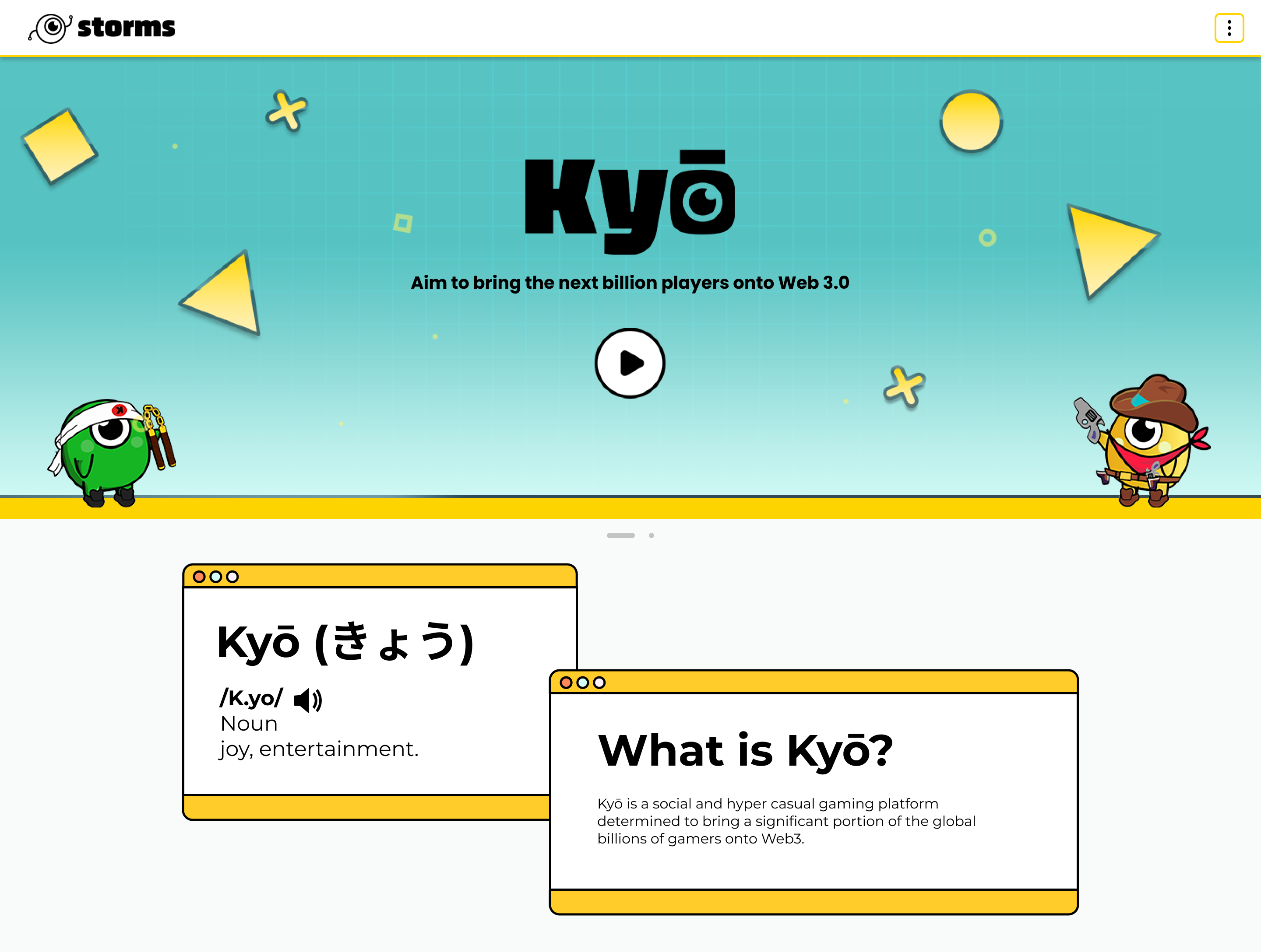
Kyo is a social, hyper-casual gaming platform built by Storms Studio (iCandy Interactive), bringing mainstream gamers into Web3 through play-to-earn tournaments, NFT avatars, and a community marketplace. As the sole UX/UI designer, I owned the full web platform end to end.
Challenge
Making Web3 feel like a game, not a protocol
Web3 gaming platforms in 2022–23 shared a problem: built for crypto-native users, they alienated everyone else. Wallet addresses, NFT ownership, token economies, and reward flows are genuinely complex, but Kyo's audience was mainstream casual gamers who had never touched a blockchain product.
The challenge was not explaining Web3. It was hiding the complexity entirely, so a player could join a Fruit Ninja tournament, earn a reward, and transfer USDT to their wallet without ever feeling like they were doing something technical.
Would a regular mobile gamer understand this without any onboarding? Every flow had to answer that question.
Scope
One designer. The entire platform.
I was the only UX/UI designer on the project. A graphic designer handled character art. Everything else, from information architecture to final UI and developer handoff, was mine across six interconnected product areas.
Tournament System
The core engagement loop: join, track leaderboard position, claim NFT or USDT rewards. Every state designed: ongoing, completed, upcoming, no-reward, countdown, claimed.
Rewards & Wallet
Multi-step claim with 1–3 simultaneous prize states, USDT transfer with pre-filled address, confirmation, and a blockchain verification link.
Referral Leaderboard
Top-100 ranking with animated top-3 badge states, current-user pinning, and reward claim gated behind a countdown.
Shop & Marketplace
Full NFT storefront with coin packs, avatar chests, and passes, plus a peer-to-peer marketplace, logged-in/out states, and Halliday free-trial integration.
Collection & Profile
A filterable NFT browser by rarity, type, level, and power, and a profile page displaying owned assets with sort and search.
Marketing Homepage
The public landing page communicating platform value: avatars, tournaments, play-to-earn mechanics, roadmap, and team.
Approach
Designing for two users at once
Every screen had to work for two mental models simultaneously: a crypto-native user who understood wallets and NFTs, and a casual gamer who just wanted to play and win something. Three principles resolved that tension.
Design
Selected flows
01 · Tournament Hub
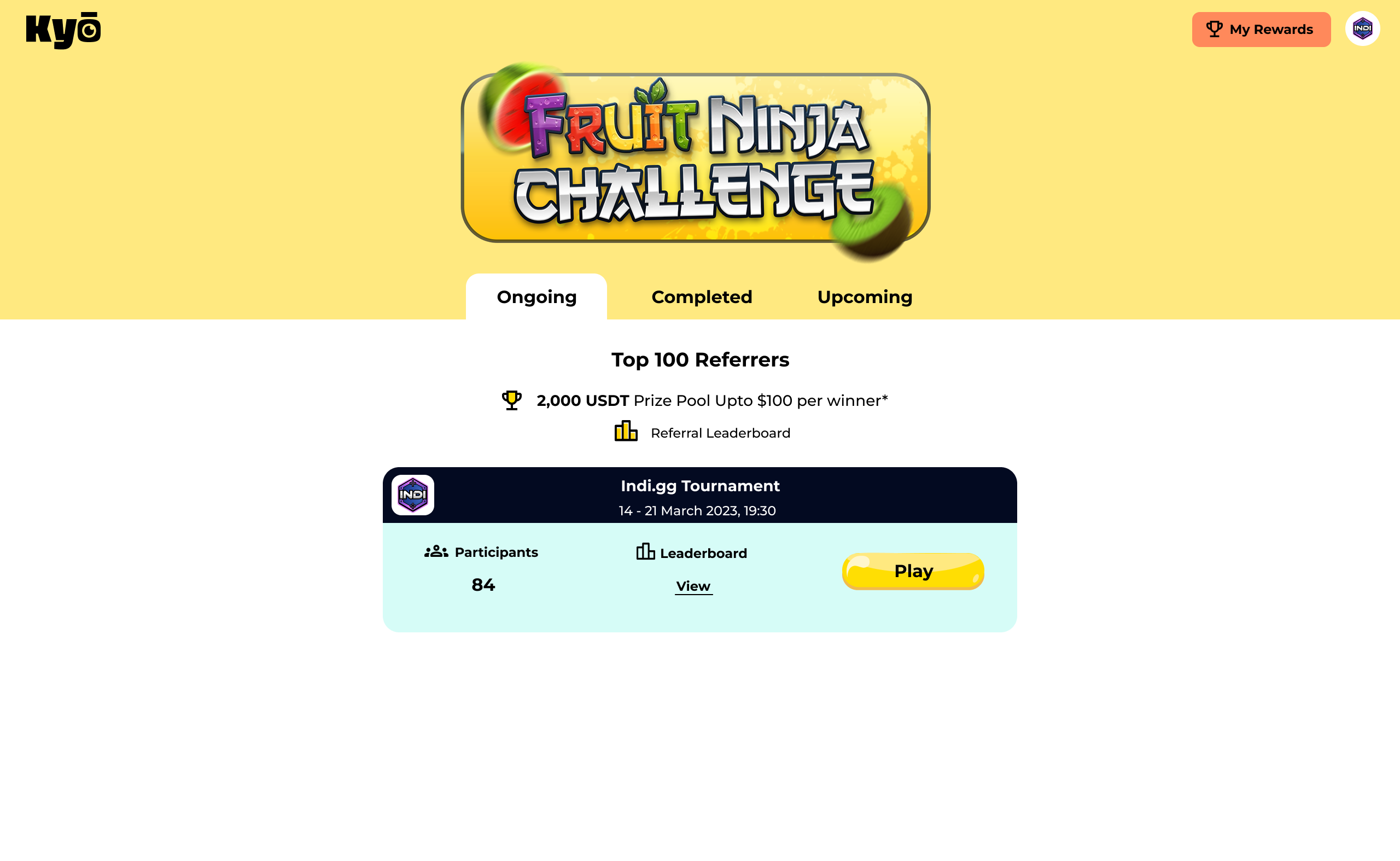
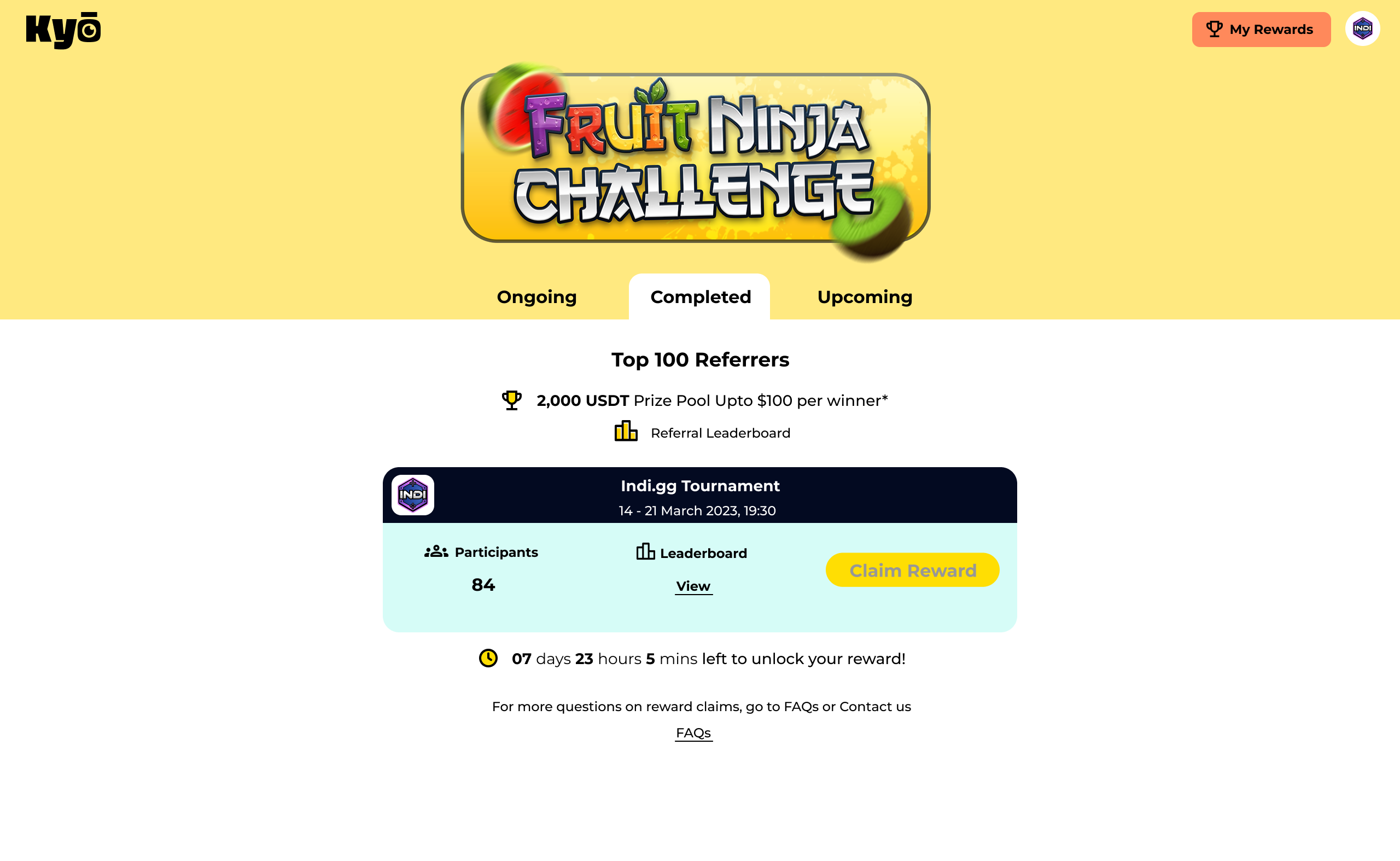
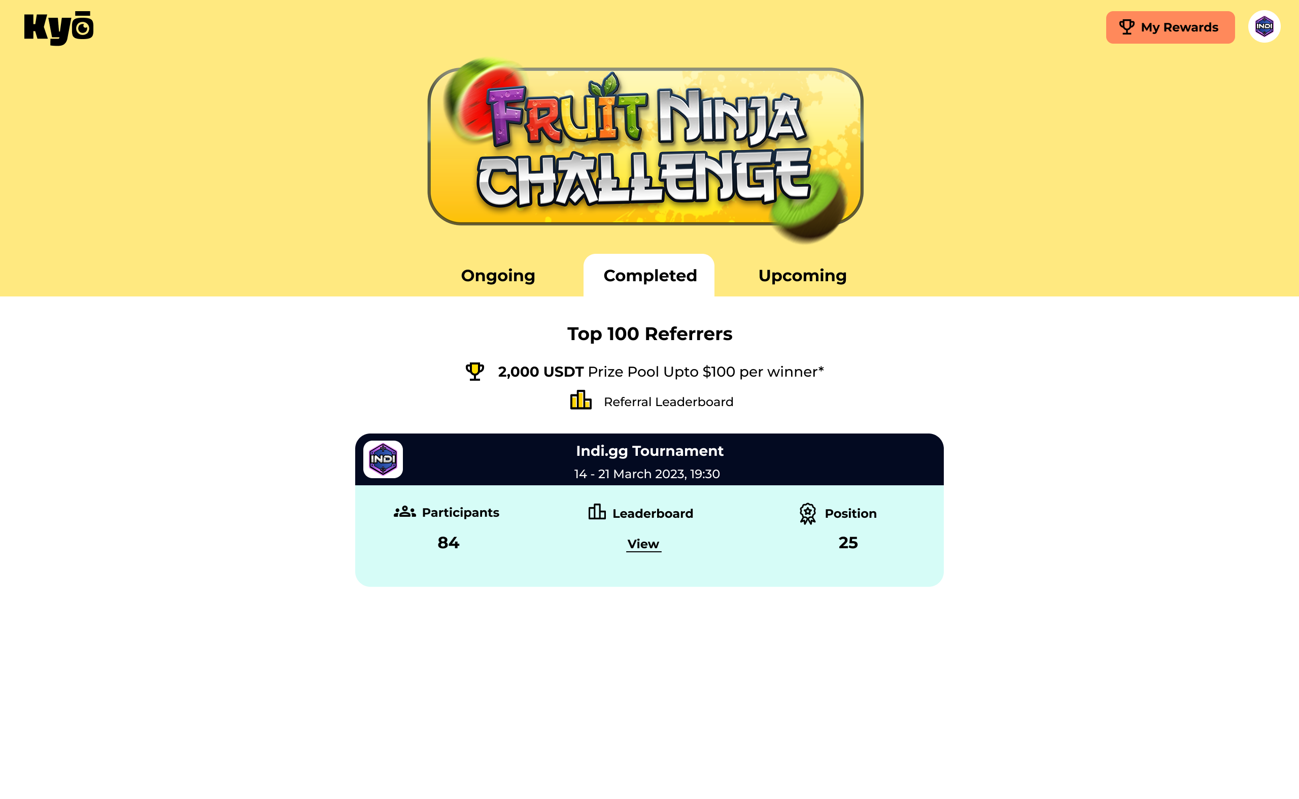
The Kyo Challenge: seven states, one page
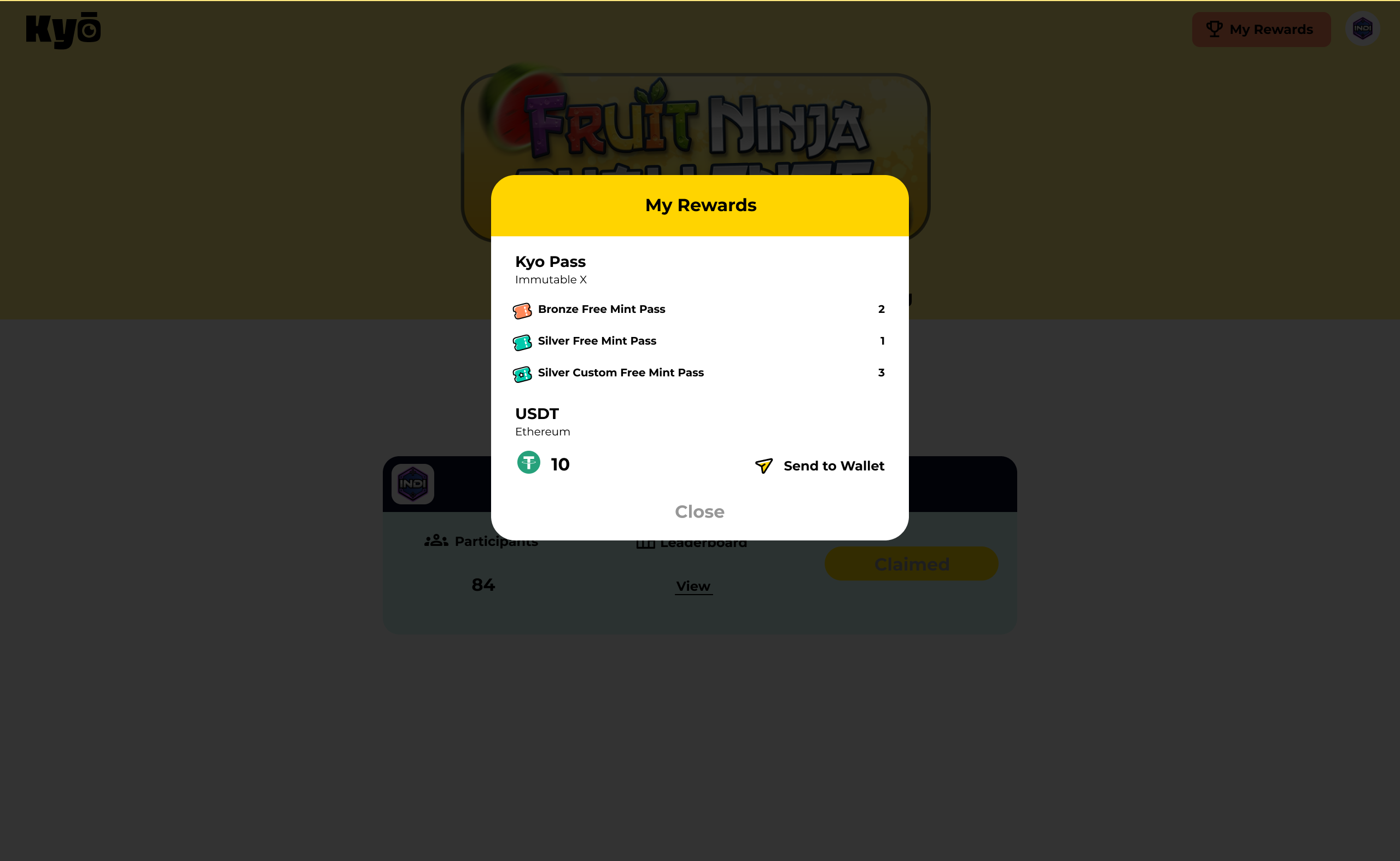
A tabbed activity feed (Ongoing / Completed / Upcoming) with a persistent leaderboard header. Each card's CTA changed by state: "Play" while ongoing, "Claim Reward" when won, or the user's position when no reward applied. I designed and spec'd all seven states, including the edge cases: no upcoming tournaments, countdown-to-unlock, and the position-only "no reward" view.
02 · Reward Claim Flow
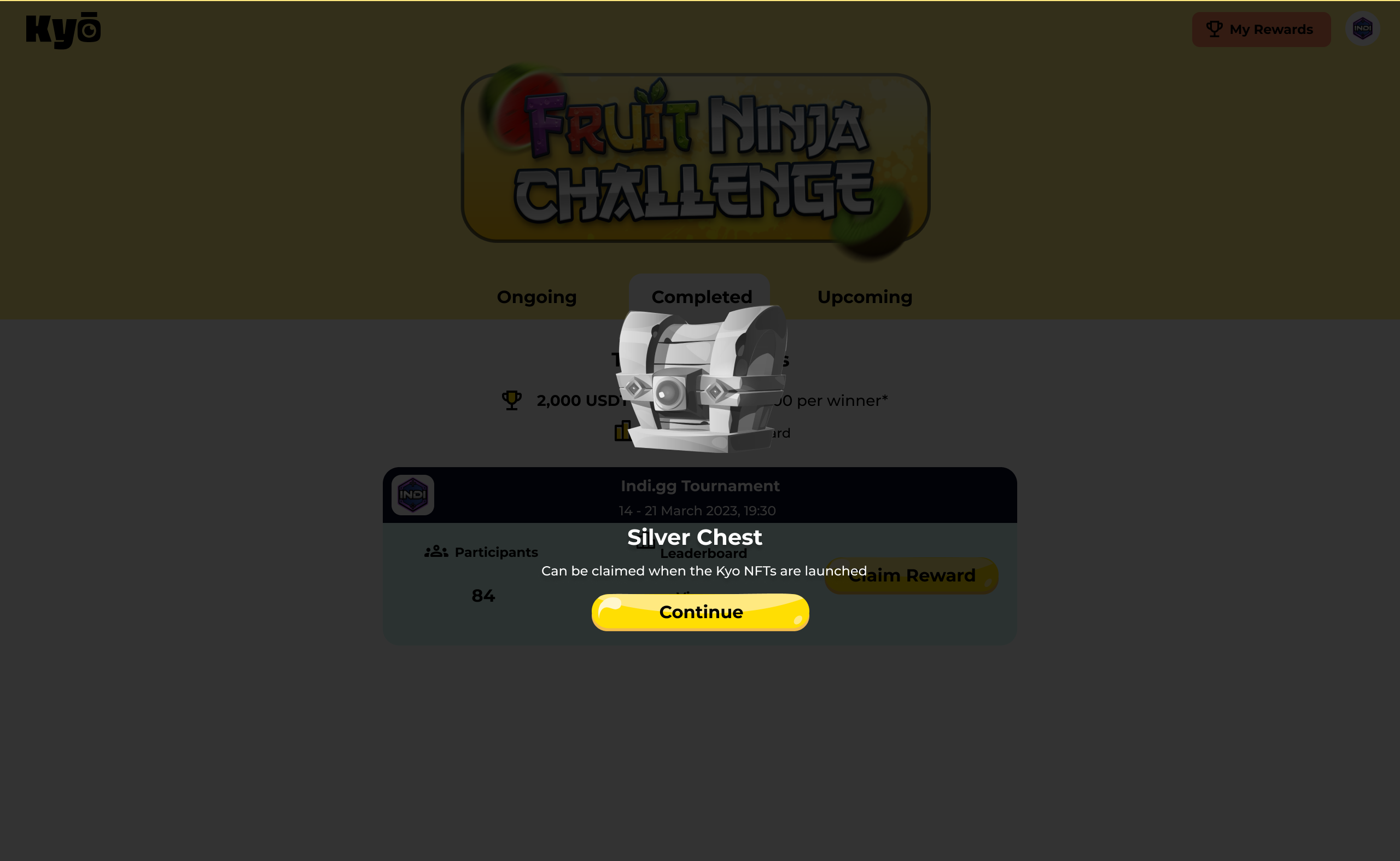
Claiming a prize, including the edge cases
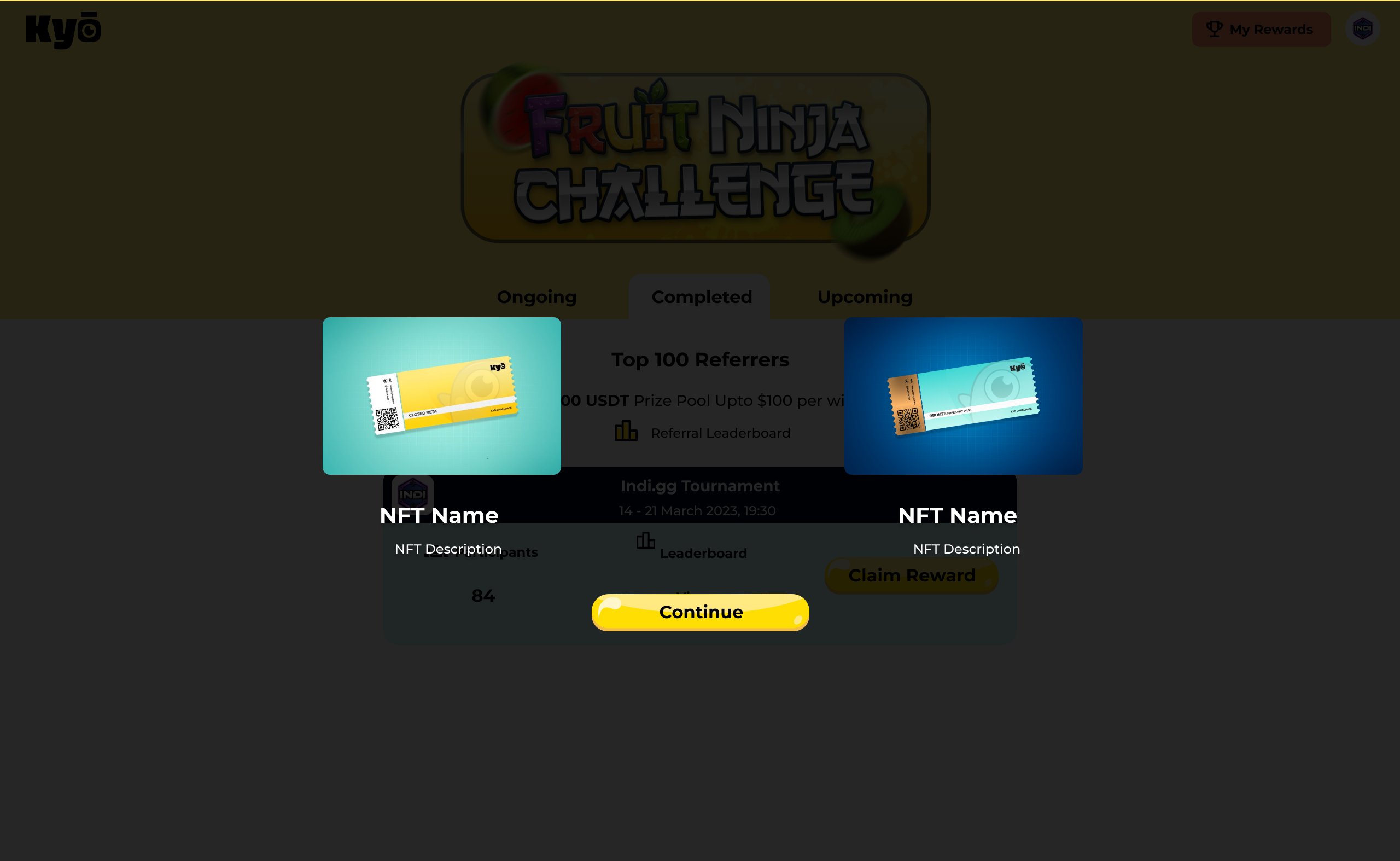
One of the most technically complex flows. Winners claim through a multi-step overlay: selecting a prize (built to handle 1, 2, or 3 simultaneous prizes without breaking), then transferring USDT to an Ethereum wallet via a pre-filled address. A confirmation step and a blockchain verification link reduced anxiety around an irreversible action. Every step had to feel low-stakes, even though the action was financial.
03 · Referral Leaderboard
Social status made visible
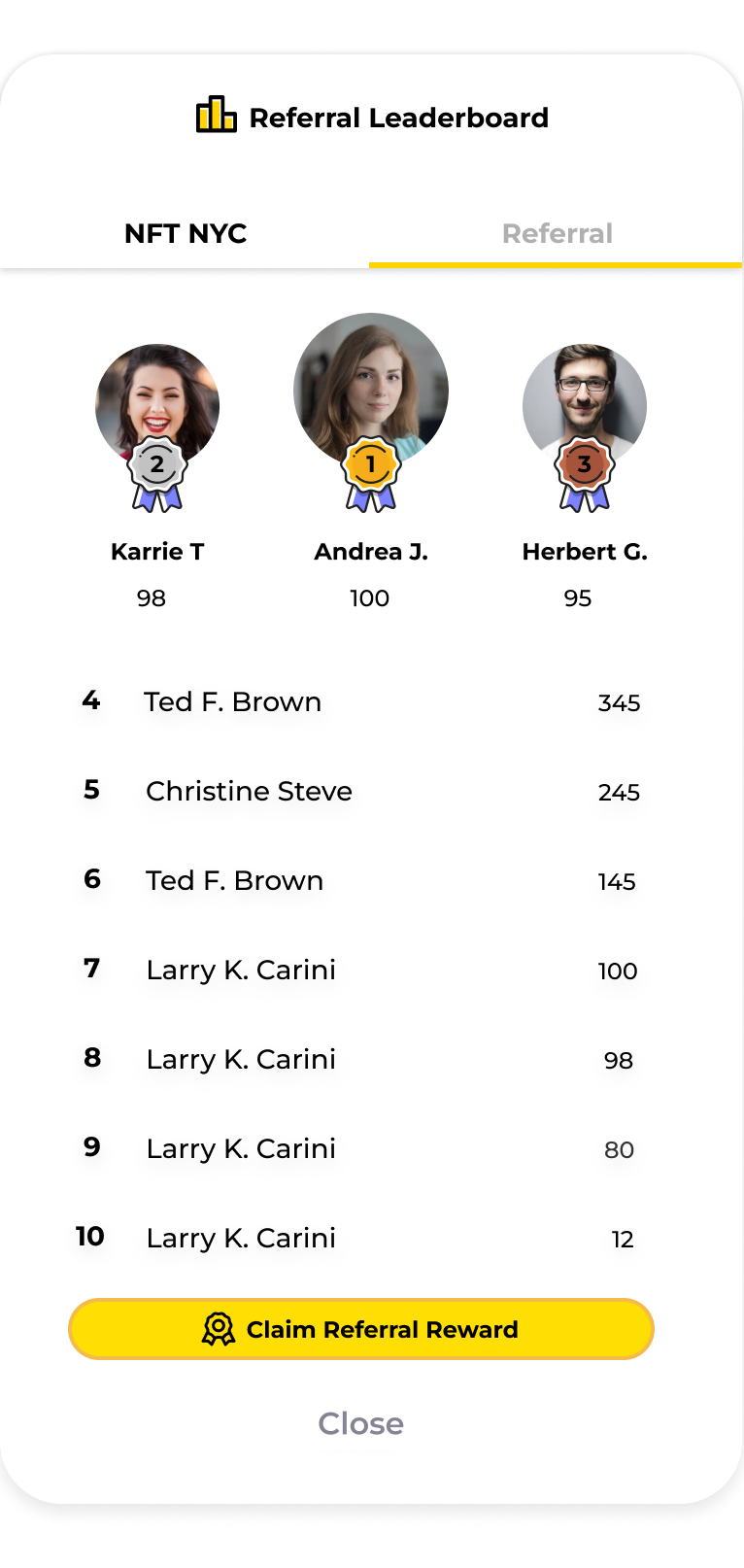
The leaderboard surfaced a user's position at all times, pinned at the bottom when outside the top 10, so they always knew where they stood. I specified a clockwise-stroke animation for the top-3 badges to signal social status without adding UI weight. Reward claiming was gated behind a countdown shown only to eligible users, preventing confusion for those who wouldn't be paid out.
04 · Shop & Marketplace
An NFT store that felt like a game shop
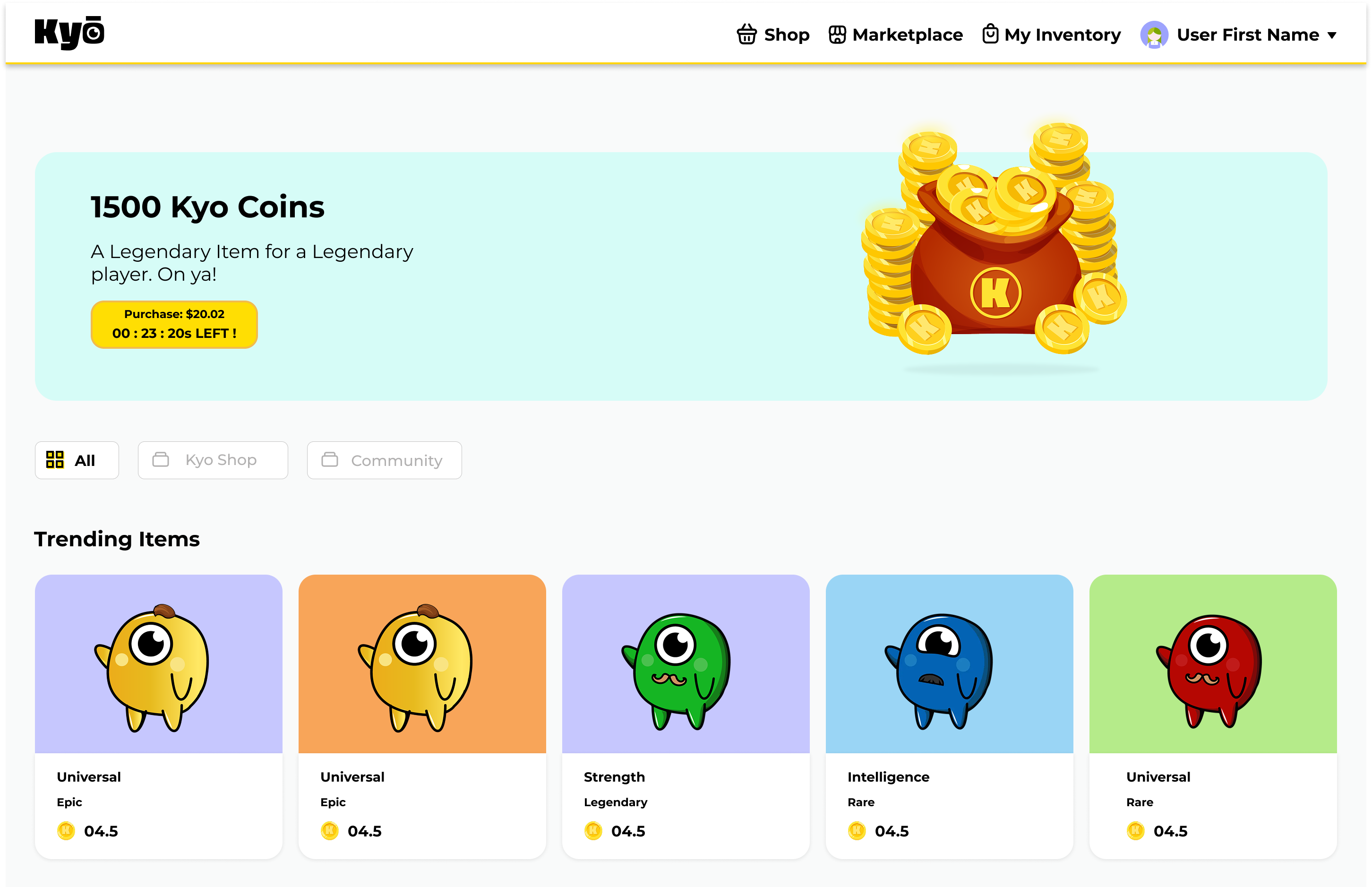
Four product categories: coin packs, avatar chests, passes, and a peer-to-peer marketplace. I designed the full logged-out state (sign-in prompts in place of purchase CTAs), item detail pages in two content states, a Redeem Pass flow for beta holders, and the Halliday free-trial integration. The visual language echoed familiar mobile game stores, with hero banners, card grids, and rarity colour coding, so it felt earned rather than novel.
05 · User Profile & Halliday
Ownership made tangible
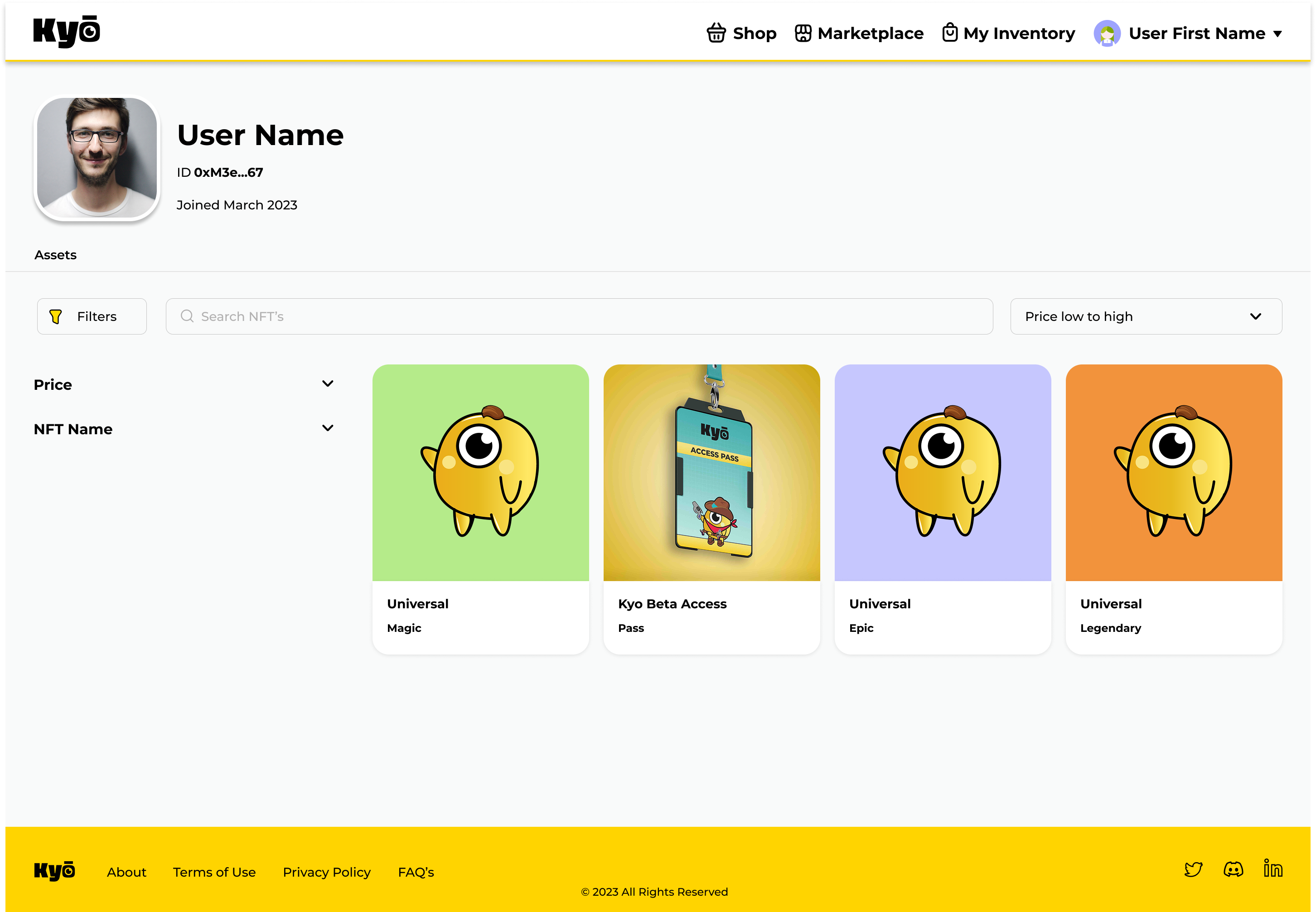
The profile displayed all owned NFTs in a browsable, filterable inventory, making digital ownership concrete rather than abstract. The Halliday integration added a secondary path: users could try an avatar free before committing, lowering the friction of a first Web3 transaction for non-crypto users.
Outcome
Shipped and live to users
The platform launched with tournaments, reward flows, leaderboard, shop, and profiles all going live. As the sole designer, I took each flow from blank canvas to production handoff, working directly with engineers across the 12-month engagement. The product was sunset in 2023 when funding ended.
Reflection
Designing for Web3 is fundamentally a trust problem. The margin for confusion is zero.
A misunderstood flow didn't just frustrate a user. It could cost them money or destroy their trust in the platform. That raised my standard for state completeness and edge-case coverage permanently. Mapping every state before opening Figma became automatic: holding the full system in your head while designing a single screen, so local decisions stay consistent with the product's global logic.