B2B SaaS · EdTech · Web Platform
Mentafy
Designing a SaaS platform for authorship analysis and academic integrity.
Redesigned an early-stage product from an unstructured prototype into a clear, scalable user experience, improving activation and project completion as the sole designer working directly with the founders.
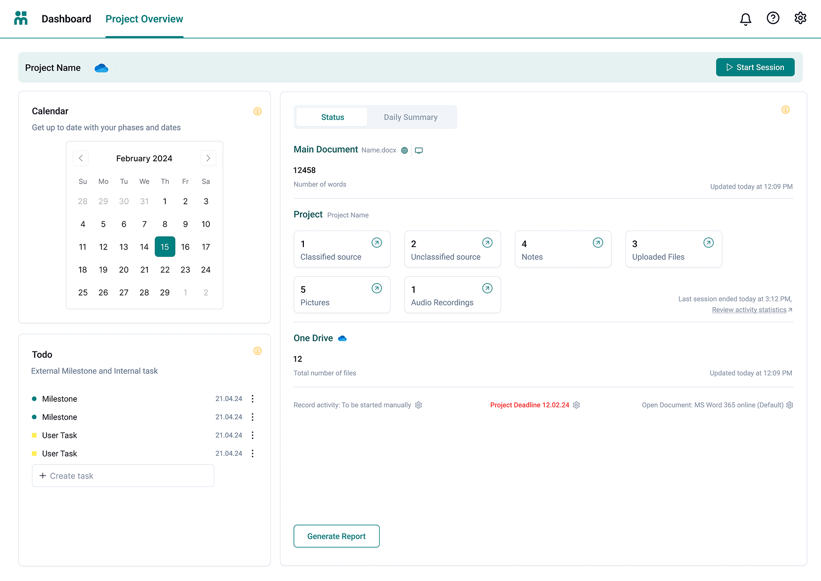
Before
The old experience
The product lacked structure and a clear user flow. Mentafy's core workflow (project creation → writing session → report generation) was spread across loosely connected screens with no sense of progression.
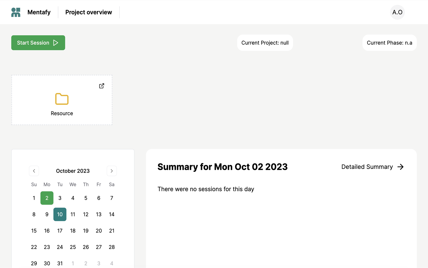
Old experience: no hierarchy, scattered actions, no clear entry point.
Challenge
The problem
Users struggled to understand how to use the product effectively. The interface created friction at every key step of the core workflow, leading to high drop-off before completion.
Business impact
Low adoption, poor activation, and incomplete projects. The product's core value was unreachable for most users who attempted to use it. This was a structural UX problem, not a feature gap.
before redesign
+15 percentage points
Scope
Role & responsibilities
01 · Software
UI/UX Design
02 · Growth
Website & Marketing
03 · Brand
Branding & Events
Approach
Process
01 · Discovery
Finding the real problems before designing anything
An early acquisition push had just landed a record number of sign-ups, but the next step in the funnel, starting a real project, hadn't moved with it. Registrations were up; completion wasn't. That gap was the signal something structural was wrong, not a messaging problem.
I ran a structured heuristic evaluation across all three core product surfaces (project creation, writing session, and report generation) and catalogued 14 distinct friction points by severity and screen.
The critical finding: the primary action, starting a session, was buried three navigation levels deep, visually indistinguishable from secondary controls. This single issue caused the majority of drop-off before completion.
02 · Structuring
Architecture before pixels, always
The original product had no dedicated home state; users entered directly into a project context with no orientation. I proposed a three-tier model: Home for overview, Project for context and session entry, Workspace for focused execution.
This reduced navigation depth from five levels to three, and gave users a mental model that matched how they actually think about their work, before I touched any visual design.
03 · Design & iteration
Three cycles, each answering a specific question
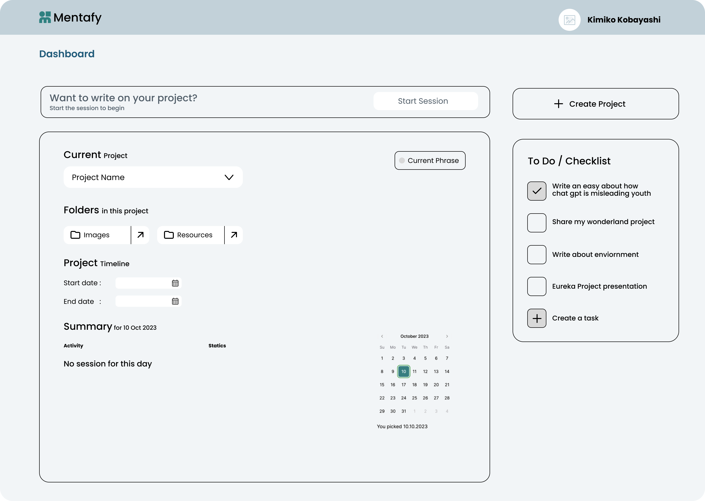
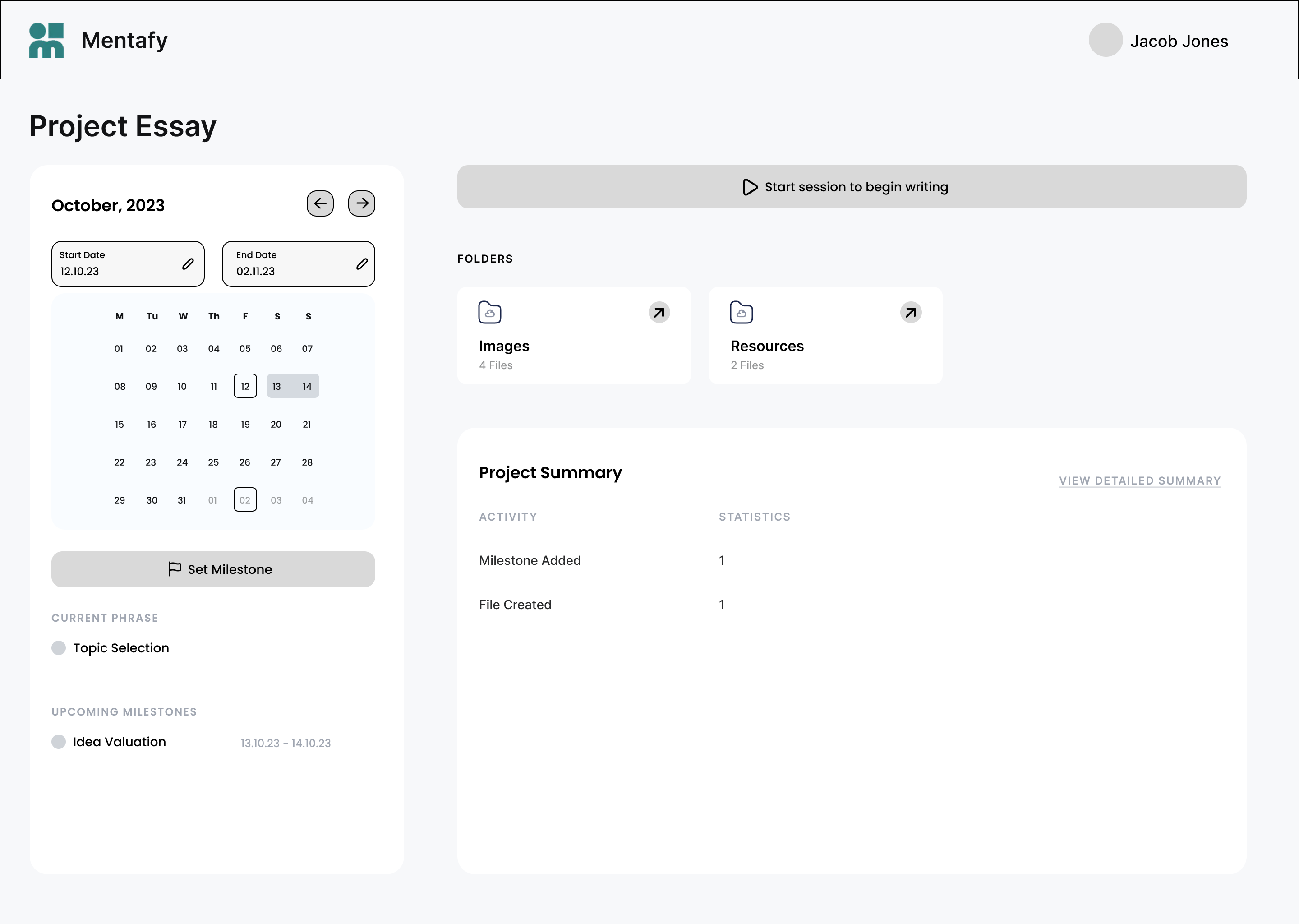
I ran three major design cycles across the core screens, presenting each to the CEO and CTO before moving forward. V1 validated the structural model, V2 established the session layout and a clear action hierarchy, and V3 shipped with the guided checklist.
04 · A team decision
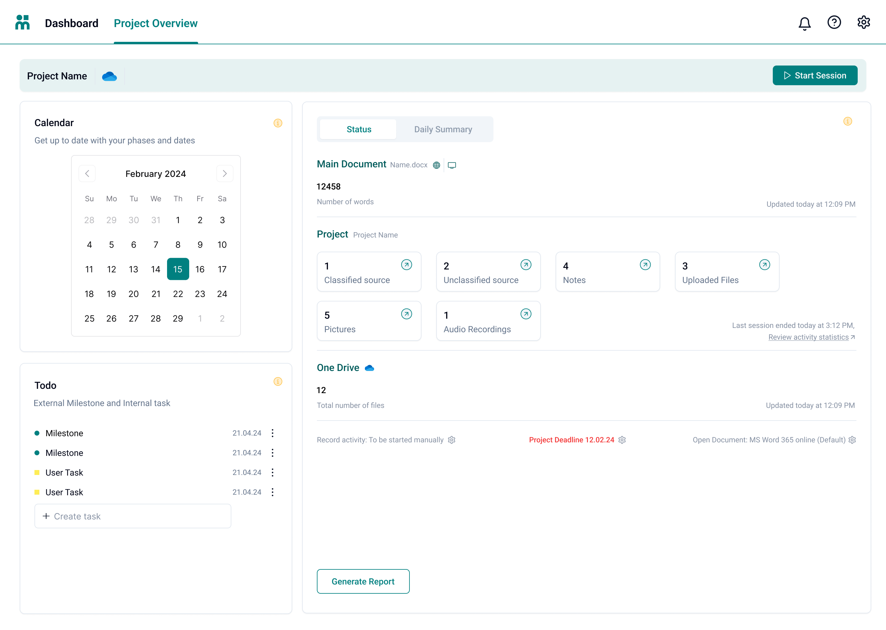
Letting users choose and switch their writing tool
A core friction point sat at sign-up. Mentafy connects to your document through either Microsoft Word or Google Docs, but the original flow locked you in: sign up with Microsoft and you could only use Word, with no path to Google Docs later, and vice versa. Users who picked wrong were stuck.
This wasn't a solo design call. The whole team worked through it. We replaced the forced choice with a "Pick your preferred way to work" step that frames the no-permission Word add-in as recommended, lets users connect OneDrive or Google Drive when they're ready and, critically, allows switching later instead of committing at sign-up.
It didn't move the completion metric directly, but it removed a recurring source of onboarding confusion and support load. It was the kind of structural fix that quietly makes everything downstream work better.
Design
Core product screens
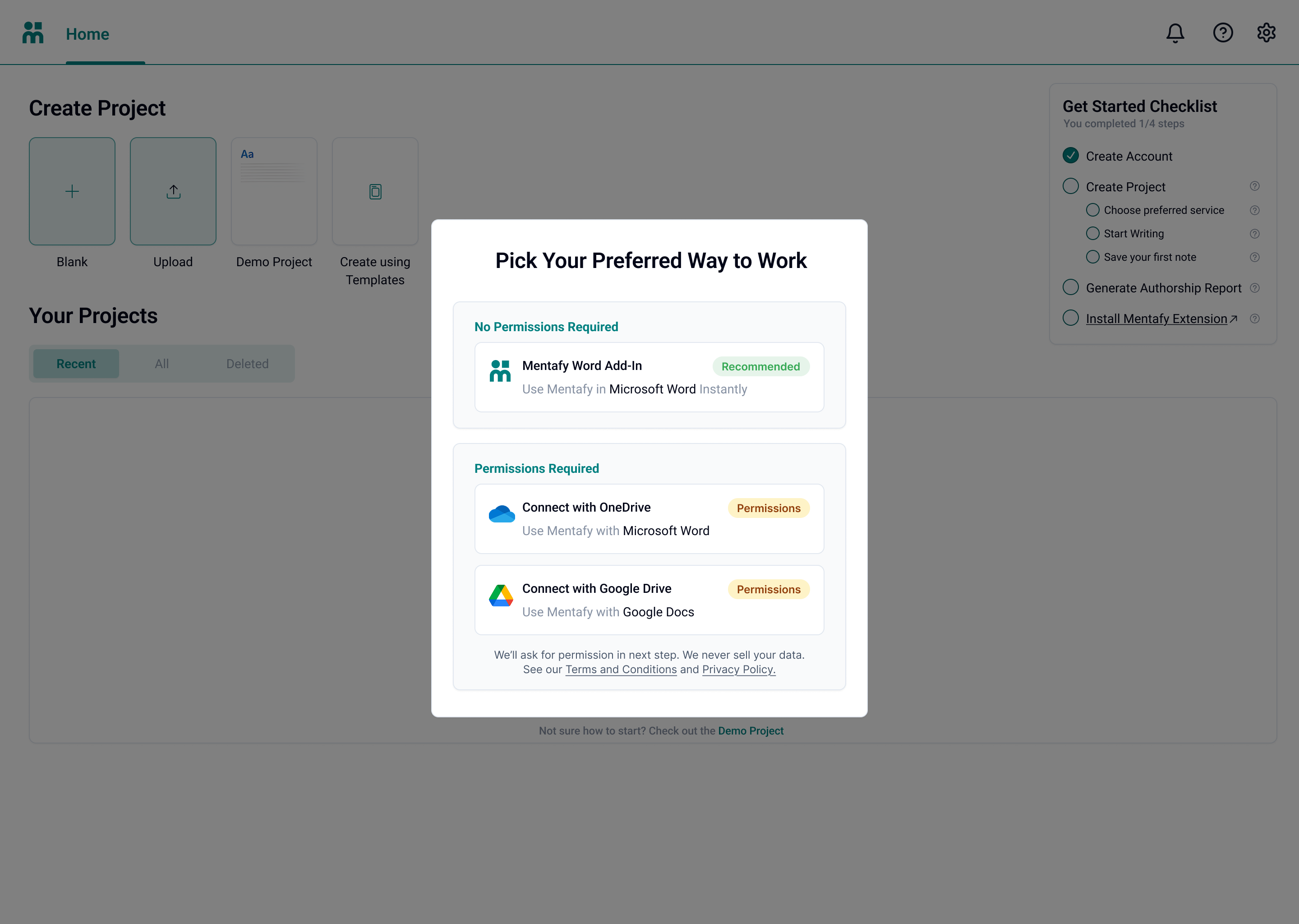
01 · Home screen
A clear starting point
Introduced a dedicated Home layer to separate orientation from execution, giving users context before entering any project.
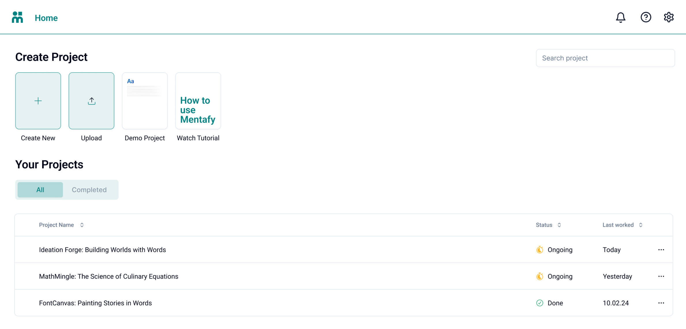
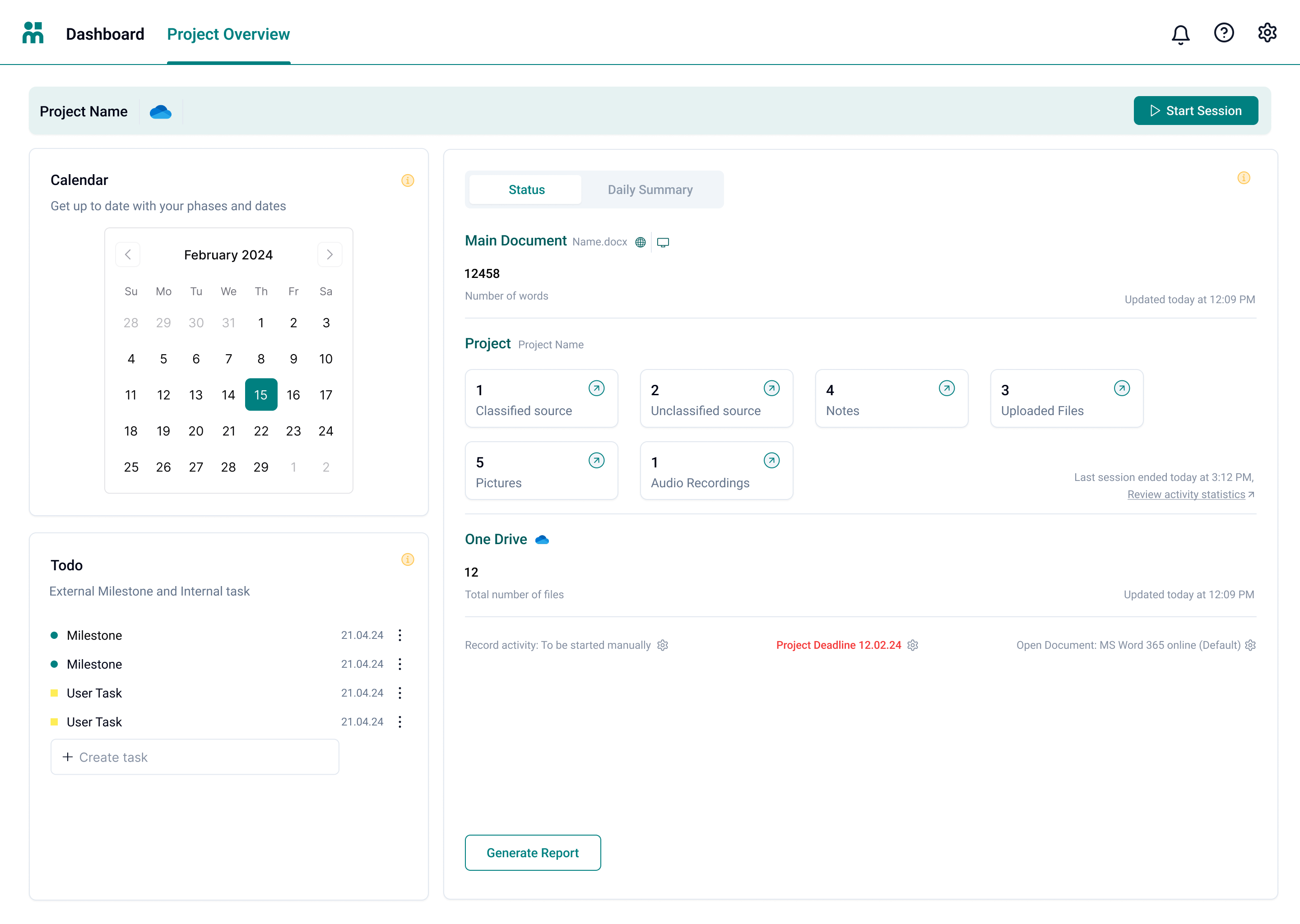
02 · Project overview
Action-first hierarchy
Redesigned to surface the most critical action, starting a session, as the dominant element, with supporting context structured beneath it.
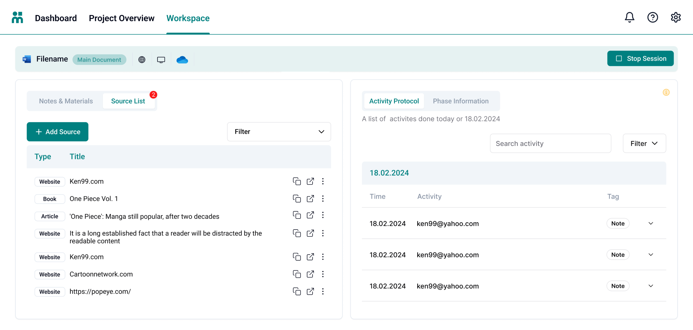
03 · Workspace
Focused execution
Designed a split-panel workspace that keeps writing and activity tracking in parallel, eliminating context-switching and reducing cognitive overhead.
04 · Checklist feature
Guided completion
Added a lightweight progressive checklist to guide users through key steps. It was a small addition that directly moved the completion metric, and the highest-leverage change in the project.
Results
Impact
Growth
Website & growth
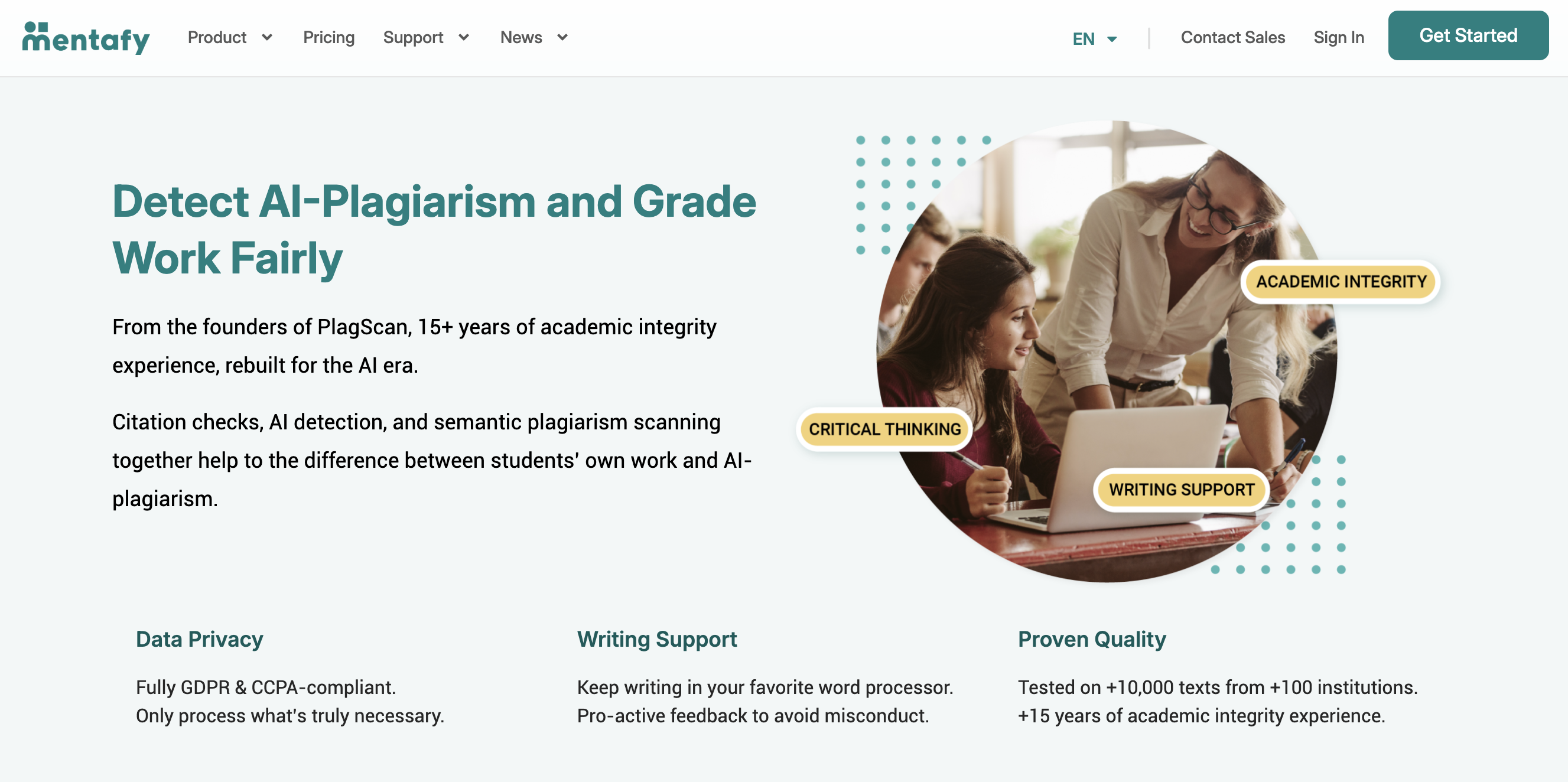
In parallel to product design, I owned the company website and user-acquisition efforts, from design to implementation and data-driven iteration. It was one of two projects the CTO specifically called out as a standout contribution in my reference letter.
Reflection